PROJECTS
Year
2019
Deliverables
Branding
Illustrator
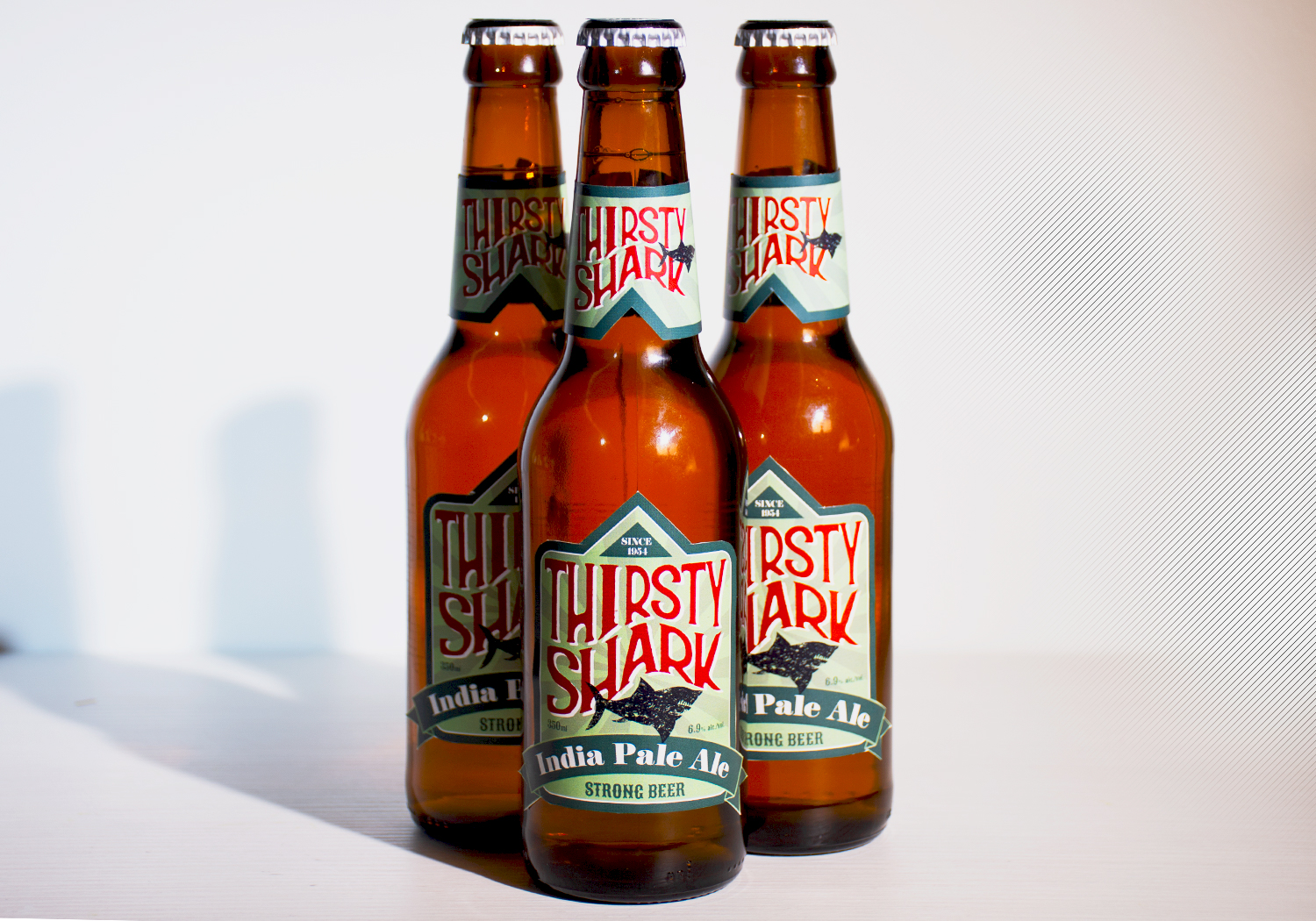
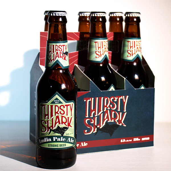
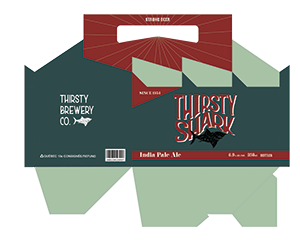
This new brand will target young, hip, sexy and tough upper middle class males, age 25 and 30. The theme of the design is nautical. To show the theme, the typeface is wavy. The black and rough textured shark image is chosen to show the strength of the beer. The triangle shape of the label on the top represents a shark’s fin which also represents power since the shark is the king of the sea. To stand out from the background, red and white shadow colours are used for the typeface while green based colours are used for the background. To highlight the kind of beer, a ribbon shape is used to separate space from the label. This retro design will challenge customers to try this beer.