PROJECTS
Year
2018
Deliverables
Editorial
Magazine design
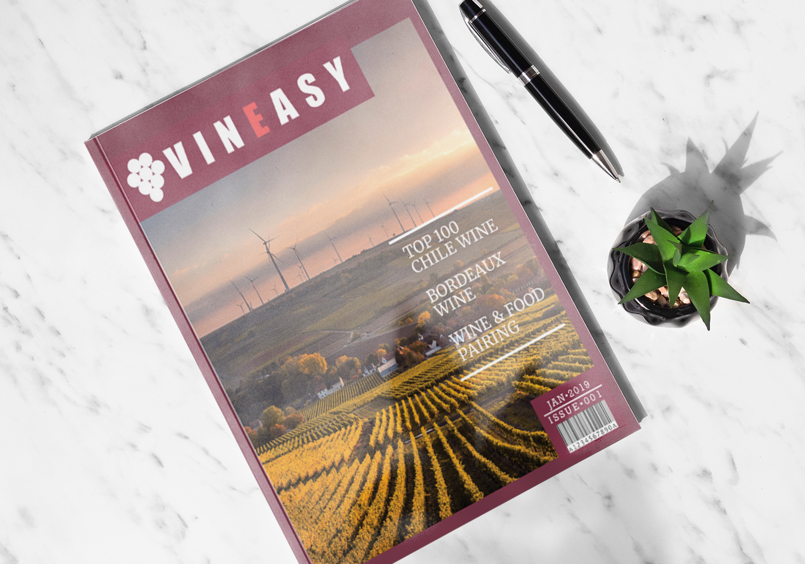
Vineasy is a magazine for wine beginners who are interested in wine. The nameplate is simple. It contains the icon and the wordmark. The brand mark represents grapes. Therefore, a wine related image is the main source of the icon. It may help viewers remember the magazine’s name. The letter E’s colour is different from other letters to create a symmetrical balance in the logo. This balance gives a stable feeling and trust to viewers. In addition, the logo was made to stand out from the banner by using white for the logo and pantone 1785 for the banner. This is an effective way to grab viewer’s attention on the newsstand. The issue number and date is displayed in a banner with white text. The issue number and date will be white. The banner’s colour will be pantone 1785.